Creating GIF Animations from LaTeX Figures: A Comprehensive Tutorial
Category: Latex
Date: 2 months ago
Views: 562
Introduction:
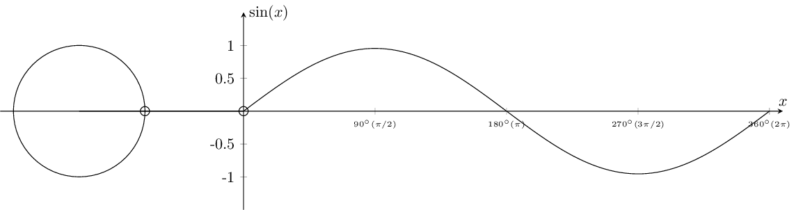
Welcome to this tutorial on creating animated mathematical plots using LaTeX and TikZ. LaTeX offers powerful tools for generating dynamic documents, and in this tutorial, we'll explore how to create animated GIFs illustrating mathematical functions. Specifically, we'll generate a series of PDF pages depicting the sine function graph alongside the unit circle, which we'll then convert into a GIF animation.
Purpose of the Script:
The LaTeX script I'll share produces a sequence of PDF pages showing the graph of the sine function and its relationship with the unit circle. By converting these PDF pages into a GIF animation, we can visually demonstrate the behavior of the function and its connection to the unit circle.
Breakdown of the Script:
1. Setting up the environment
\documentclass[tikz]{standalone}
\usepackage{amsmath,amssymb}
\usepackage{pgfplots}

\pgfplotsset{compat=1.13}
\usepgfplotslibrary{fillbetween}

\begin{document}

\begin{tikzpicture}
\begin{axis}[
    set layers,
    x=1.5cm,y=1.5cm,
    xmin=-3.7, xmax=8.2,
    ymin=-1.5, ymax=1.5,
    axis lines=center,
    axis on top,
    xtick={2,4,6,8},
    ytick={-1,-.5,.5,1},
    xticklabels={$90^{\circ} (\pi/2)$, $180^{\circ} (\pi)$, $270^{\circ} (3\pi/2)$,$360^{\circ} (2\pi)$},
    xticklabel style={font=\tiny},
    yticklabels={-1,-0.5,0.5,1},
    ylabel={$\sin(x)$}, y label style={anchor=west},
    xlabel={$x$}, x label style={anchor=south},
]
\end{axis}
\end{tikzpicture}
\end{document}
We'll start by setting up the environment for our plot. We begin by defining the axis environment using the axis environment provided by the pgfplots package. Within this environment, we specify various properties such as the size of the plot (x=1.5cm, y=1.5cm), the range of values for the x and y axes (xmin=-3.7, xmax=8.2, ymin=-1.5, ymax=1.5), and the appearance of the axis lines (axis lines=center). Additionally, we customize the appearance of the tick marks and labels on both axes using the xtick, ytick, xticklabels, and yticklabels options.
To enhance readability, we format the x-axis tick labels to display angles in degrees along with their corresponding radians. This is achieved using the xticklabels option combined with LaTeX formatting commands. Furthermore, we specify labels for the x and y axes using the xlabel and ylabel options, along with their respective styles to control their placement (anchor=west for the y-axis label and anchor=south for the x-axis label).
By setting up the environment in this manner, we ensure that our plot is properly configured with appropriate axis limits, tick marks, and labels, providing a solid foundation for visualizing the sine function and its relationship with the unit circle.
2. The canvas and x-axis
\pgfonlayer{pre main}
\addplot [fill=white] coordinates {(-4,-2) (8.5,-2) (8.5,2) (-4,2)} \closedcycle;
\endpgfonlayer

\path[name path=xaxis] (axis cs:-4,0) -- (axis cs:8,0);
\coordinate (O) at (axis cs:0,0);
Next, we utilize the \pgfonlayer{pre main} command to specify a new layer for drawing elements prior to the main plot. Within this layer, we use the \addplot command to draw a filled shape. The coordinates keyword specifies the vertices of the shape, which form a rectangle with corners at (-4,-2), (8.5,-2), (8.5,2), and (-4,2). The \closedcycle command ensures that the shape is closed, creating a closed region. Finally, the \endpgfonlayer command closes the pre-main layer, completing the setup for this portion of the plot. This code segment is crucial as it defines a background rectangle that serves as the backdrop for the main plot, enhancing its visual clarity and providing a reference frame for the subsequent graphical elements.
Next, we define the x-axis for later reference by using the \path command to create a path named name path=xaxis. This path spans from the point (-4,0) to (8,0) within the axis coordinate system. Additionally, we define a coordinate named (O) at the origin of the axis, denoted as (0,0) in the axis coordinate system. These steps are crucial for subsequent calculations and graphical elements, as they establish a reference line for the x-axis and a reference point at the origin.
3. plot and circle
% plot and circle
\addplot [samples=100,domain=0:8, name path=myplot](\x,{3 * sin(\x*45)/pi});
\draw[name path=circle] (axis cs:-2.5,0) circle (1.5cm);
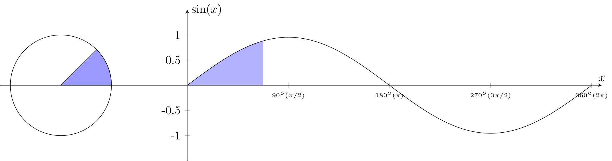
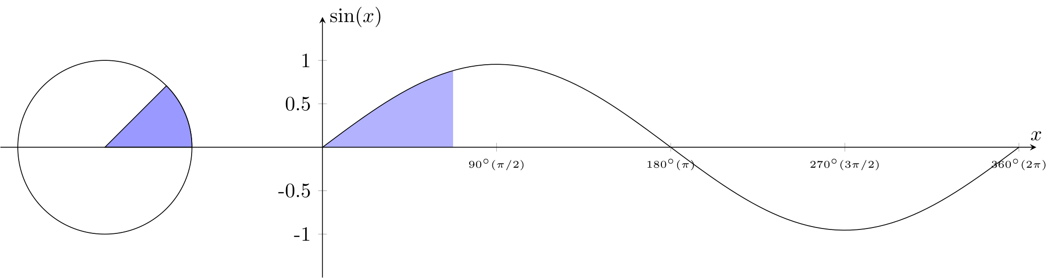
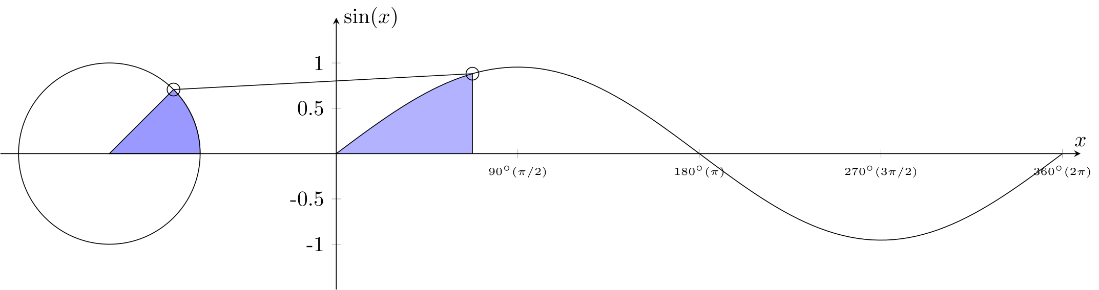
Next, we proceed to plot the sine function and draw the unit circle. The \addplot command is used to plot the sine function, specifying 100 samples over the domain [0,8] using the samples and domain options. The mathematical expression for the sine function is provided as {3 * sin(\x*45)/pi}, where \x represents the variable of the function. Additionally, we name the path of this plot as myplot using the name path=myplot option.
For the unit circle, we use the \draw command to draw a circle centered at (-2.5,0) with a radius of 1.5cm. This is achieved by specifying the center coordinates and the radius within parentheses. The resulting circle is named circle using the name path=circle option. These elements form the basis for visualizing the sine function alongside the unit circle, providing valuable insights into their relationship.
4. fill in circle and plot
% fill in circle
\draw[black,fill=blue!40] (axis cs:-2.5,0) -- (axis cs:-1.5,0) arc (0:45:1.5cm) coordinate (cc) -- cycle;
% fill in plot
\addplot[blue!30] fill between[of=xaxis and myplot, soft clip={domain=-1:1.5}];
Here, we fill the area inside the unit circle and plot a segment of the sine function. The shape is drawn with a blue fill color, starting at (-2.5,0), moving to (-1.5,0), and tracing an arc from 0 to 45 degrees along the unit circle (We'll generate figures for other angle values using a variable \mainangle later). The coordinate (cc) is defined at the end of the arc, and the shape is closed to form a closed region.
We also fill a part of the plot between the x-axis (defined as 'xaxis') and the sine function plot (defined as 'myplot'). The 'soft clip' option restricts the filling to the specified domain, which will later be represented by the variable \mark. This variable will be dynamically adjusted to fill different parts of the plot based on its value, all the different figures will be making the gif animation.
\path[name path=mark] (axis cs:\mark,-1) -- (axis cs:\mark,1);
Here, we define a path named 'mark' using the \path command. This path spans from the point with x-coordinate equal to the value of \mark and y-coordinates -1 and 1 within the axis coordinate system. This path will be used later to find the intersection with the sine function plot.
\path[name intersections={of=mark and myplot,by=cp}];
This command finds the intersection point between the 'mark' path and the sine function plot ('myplot'). The intersection point is named 'cp' and will be used for further calculations.
% small circles
\draw (cc) circle (3pt);
\draw (cp) circle (3pt);
These commands draw small circles at the coordinates 'cc' and 'cp', which represent the end point of the arc and the intersection point, respectively.
\draw (cc) -- (cp) -- (cp|-O);
This command draws lines connecting the points 'cc' and 'cp', as well as 'cp' and the x-axis ('O'). The notation 'cp|-O' specifies the point where the vertical line from 'cp' intersects the x-axis, ensuring the line extends to the x-axis. Basically (cp|-O) creates a new coordinate with the x-coordinate from cp and the y-coordinate from O. This effectively creates a vertical line from the point cp down to the x-axis, intersecting it at the same x-coordinate as cp.
5. Generating multiple figures
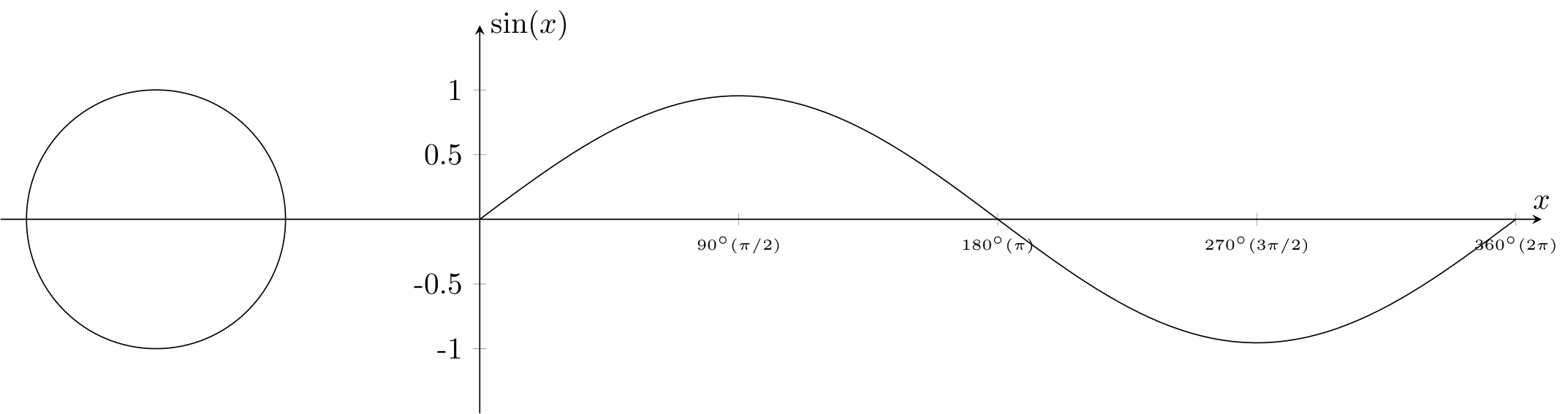
\foreach \mainangle [count=\xx, evaluate=\mainangle as \mark using (\mainangle/45)] in {0,5,...,355,360}{
\begin{tikzpicture}
.....
We're using a for loop to generate figures for different values of angles, In this for loop, \mainangle iterates over angles from 0 to 360 degrees with a step size of 5 degrees. For each iteration, \mark is calculated as \mainangle divided by 45. The generated figures will display different segments of the sine function along with the corresponding unit circle arcs for each value of \mainangle and \mark. The conditional statement ensures that the fill between the x-axis and the sine function plot is applied only when \mainangle exceeds 5 degrees.
The full latex code
\documentclass[tikz]{standalone}
\usepackage{amsmath,amssymb}
\usepackage{pgfplots}

\pgfplotsset{compat=1.13}
\usepgfplotslibrary{fillbetween}

\begin{document}
\foreach \mainangle [count=\xx, evaluate=\mainangle as \mark using (\mainangle/45)] in {0,5,...,355,360}{
\begin{tikzpicture}
\begin{axis}[
    set layers,
    x=1.5cm,y=1.5cm,
    xmin=-3.7, xmax=8.2,
    ymin=-1.5, ymax=1.5,
    axis lines=center,
    axis on top,
    xtick={2,4,6,8},
    ytick={-1,-.5,.5,1},
    xticklabels={$90^{\circ} (\pi/2)$, $180^{\circ} (\pi)$, $270^{\circ} (3\pi/2)$,$360^{\circ} (2\pi)$},
    xticklabel style={font=\tiny},
    yticklabels={-1,-0.5,0.5,1},
    ylabel={$\sin(x)$}, y label style={anchor=west},
    xlabel={$x$}, x label style={anchor=south},
]
\pgfonlayer{pre main}
\addplot [fill=white] coordinates {(-4,-2) (8.5,-2) (8.5,2) (-4,2)} \closedcycle;
\endpgfonlayer

\path[name path=xaxis] (axis cs:-4,0) -- (axis cs:8,0);
\coordinate (O) at (axis cs:0,0);

% plot and circle
\addplot [samples=100,domain=0:8, name path=myplot](\x,{3 * sin(\x*45)/pi});
\draw[name path=circle] (axis cs:-2.5,0) circle (1.5cm);

% fill in circle and plot
\draw[black,fill=blue!40] (axis cs:-2.5,0) -- (axis cs:-1.5,0) arc (0:\mainangle:1.5cm) coordinate (cc) -- cycle;
\ifnum\mainangle>5
\addplot[blue!30] fill between[of=xaxis and myplot, soft clip={domain=-1:\mark}];
\fi

\path[name path=mark] (axis cs:\mark,-1) -- (axis cs:\mark,1);
\path[name intersections={of=mark and myplot,by=cp}];
% small circles
\draw (cc) circle (3pt);
\draw (cp) circle (3pt);
\draw (cc) -- (cp) -- (cp|-O);

\end{axis}
\end{tikzpicture}}
\end{document}
Convert PDF to GIF using ImageMagick
Finally, we use ImageMagick's convert command to create a GIF from all the figures generated. We specify the following parameters:
convert -density 160 -delay 8 -loop 0 -background white -alpha remove sinus-gif.pdf test.gif
Explanation of parameters:
-density 160: Specifies the density of the input PDF file. Higher density results in better image quality.-delay 8: Specifies the delay between frames in the resulting GIF, in hundredths of a second.-loop 0: Specifies that the GIF should loop indefinitely.-background white: Specifies the background color for the GIF.-alpha remove: Removes any alpha channel from the images.sinus-gif.pdf: Specifies the input PDF file containing all the figures generated.test.gif: Specifies the output GIF file to be created.
Running this command will convert the PDF file containing all the figures into a GIF animation named test.gif, which will loop indefinitely with a delay of 0.08 seconds between frames. Adjust the parameters as needed for your specific requirements.
Feel free to experiment with the provided script and modify it to create different types of animated plots. Additionally, I recommend exploring additional resources and tutorials on LaTeX, TikZ, and pgfplots for further learning.
Conclusion:
Creating animated mathematical plots with LaTeX and TikZ opens up exciting possibilities for visualizing mathematical concepts. By mastering the techniques demonstrated in this tutorial, you can create dynamic and engaging visualizations for your LaTeX documents and presentations. I hope this tutorial inspires you to explore the world of animated plots in LaTeX. Let's get started and bring our mathematical functions to life!
Related Articles

Most Recent Articles


Most Viewed Articles


0 Comments, latest
No comments.