Latex Tricks: How to Shade the Area Under a Curve in Seconds
Category: Latex
Date: March 2023
Views: 792
In this article I am going to show you how to shade an area under a curve (Think Integrals) using Latex, it is really a simple process just using the tikz and pgfplots packages. I will give you the entire working latex code. so let's get started
First let's get the usual preamble out of the way:
\documentclass{standalone}
\standaloneconfig{border=2mm 2mm 2mm 2mm}

%maths
\usepackage{mathtools}
\usepackage{amsmath}
\usepackage{amssymb}
\usepackage{amsfonts}

%tikzpicture
\usepackage{tikz}
\usepackage{scalerel}
\usepackage{pict2e}
\usepackage{tkz-euclide}
\usetikzlibrary{calc}
\usetikzlibrary{patterns,arrows.meta}
\usetikzlibrary{shadows}
\usetikzlibrary{external}

%pgfplots
\usepackage{pgfplots}
\pgfplotsset{compat=newest}
\usepgfplotslibrary{statistics}
\usepgfplotslibrary{fillbetween}

%colours
\usepackage{xcolor}
We will be using the standalone document class to generate just the picture of our plot not an entire document page, the above preamble contains all the necessary packages needed for creating our document.
The following parameters are some prepared settings for all the work with pgfplots, like using the radian for trigonometry, showing a grid and so forth. I just copy and paste them in all the documents that are using pgfplots and tikz
\pgfplotsset{
   standard/.style={
      axis line style = thick,
      trig format=rad,
      enlargelimits,
      axis x line=middle,
      axis y line=middle,
      enlarge x limits=0.15,
      enlarge y limits=0.15,
      every axis x label/.style={at={(current axis.right of origin)},anchor=north west},
      every axis y label/.style={at={(current axis.above origin) },anchor=south east},
      grid=both,
      ticklabel style={font=\tiny, fill=white}
   }
}
Now, let's get started with the actual tikz picture of our plot.
\begin{tikzpicture}
\begin{axis}[standard,
xtick={0.1,0.2,0.5,1},
ytick={0.1,0.2,0.5,1,2},
xticklabels={$0.1$,$0.2$,$0.5$,$1$},
yticklabels={$0.1$,$0.2$,$0.5$,$1$,$2$},
xlabel={ $x$},
ylabel={ $y$},
samples=1000,
xmin=0, xmax=1.3,
ymin=0, ymax=1.3]
\node[anchor=center, label=south west:$O$] at (axis cs:0,0){};
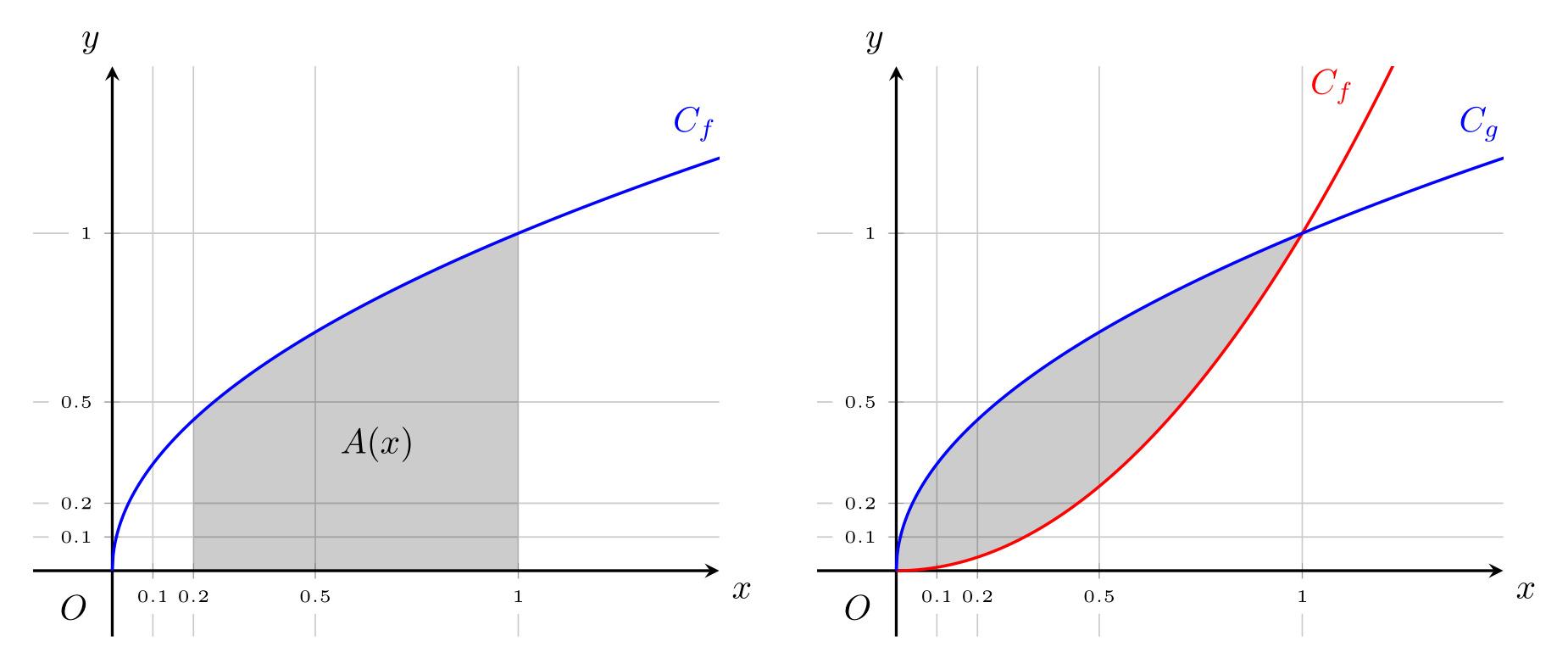
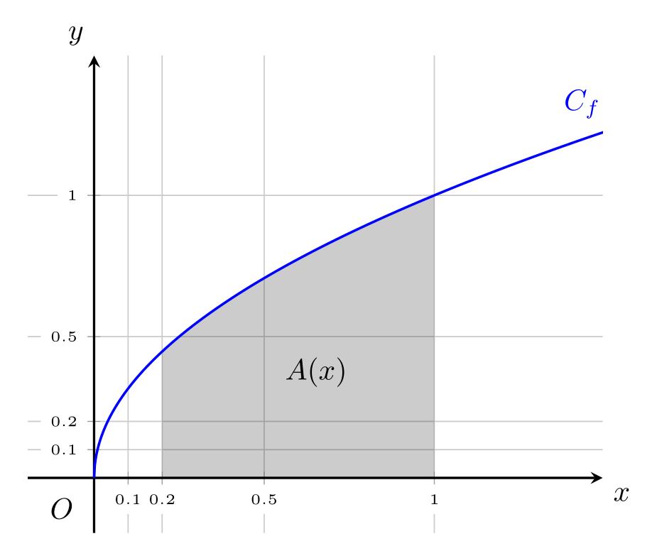
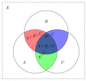
\addplot[name path=F, line width=0.3mm, blue, domain={0:2}]{sqrt(x)} node[pos=0.8, above left] {$C_f$};
\path[name path=xAxis] (axis cs: 0,0) -- (axis cs: 1,0);
\addplot[fill=black, fill opacity=0.2] fill between [of=xAxis and F, soft clip={domain=0.2:1}];
\node[anchor=center, label=south east:$A(x)$] at (axis cs:0.5,0.5){};
\end{axis}
\end{tikzpicture}
We perepare yet another set of parameters, like the xticks and ytick, and the x and y axis labels, you can change them as you see fit. you can experiment with the min and max values of the axis. and see their effects.
\node[anchor=center, label=south west:$O$] at (axis cs:0,0){};. This line creates a node at the point (0,0) on the coordinate axis, which represents the origin of the graph. The label=south west:$O$ option adds a label "O" to the node, positioned to the bottom-left of the node.
\addplot[name path=F, line width=0.3mm, blue, domain={0:2}]{sqrt(x)} node[pos=0.8, above left] {$C_f$};. This line plots a function of the form y=sqrt(x) for values of x ranging from 0 to 2. The name path=F option assigns a name "F" to the plot, which will be used later to fill the area under the curve. The line width=0.3mm, blue options set the appearance of the line to have a thickness of 0.3mm and a blue color. The node[pos=0.8, above left] {$C_f$} option adds a label "$C_f$" to the curve, positioned 80% of the way along the curve from the left, and above the curve.
\path[name path=xAxis] (axis cs: 0,0) -- (axis cs: 1,0);. This line creates a path named "xAxis" that starts from the point (0,0) on the coordinate axis and ends at the point (1,0). This path represents the x-axis of the graph. this actually doesn't do anything. it is just used int shading of the the area under the curve
\addplot[fill=black, fill opacity=0.2] fill between [of=xAxis and F, soft clip={domain=0.2:1}];. This line fills the area between the x-axis and the plot "F", for x-values between 0.2 and 1. The fill=black option sets the color of the fill to black, and the fill opacity=0.2 option sets the opacity of the fill to 20%. The of=xAxis and F option specifies the paths to fill between. The soft clip={domain=0.2:1} option clips the fill to the x-domain between 0.2 and 1. This line effectively shades the area under the curve between the x-values 0.2 and 1.
\node[anchor=center, label=south east:$A(x)$] at (axis cs:0.5,0.5){};. This line creates a node at the point (0.5,0.5) on the coordinate axis. The label=south east:$A(x)$ option adds a label "A(x)" to the node, positioned to the bottom-right of the node. This label represents a point on the curve, with x-coordinate 0.5 and y-coordinate sqrt(0.5).
And here is the entire code put together:
\documentclass{standalone}
\standaloneconfig{border=2mm 2mm 2mm 2mm}

%maths
\usepackage{mathtools}
\usepackage{amsmath}
\usepackage{amssymb}
\usepackage{amsfonts}

%tikzpicture
\usepackage{tikz}
\usepackage{scalerel}
\usepackage{pict2e}
\usepackage{tkz-euclide}
\usetikzlibrary{calc}
\usetikzlibrary{patterns,arrows.meta}
\usetikzlibrary{shadows}
\usetikzlibrary{external}

%pgfplots
\usepackage{pgfplots}
\pgfplotsset{compat=newest}
\usepgfplotslibrary{statistics}
\usepgfplotslibrary{fillbetween}

%colours
\usepackage{xcolor}

\begin{document}

\pgfplotsset{
   standard/.style={
      axis line style = thick,
      trig format=rad,
      enlargelimits,
      axis x line=middle,
      axis y line=middle,
      enlarge x limits=0.15,
      enlarge y limits=0.15,
      every axis x label/.style={at={(current axis.right of origin)},anchor=north west},
      every axis y label/.style={at={(current axis.above origin) },anchor=south east},
      grid=both,
      ticklabel style={font=\tiny, fill=white}
   }
}

\begin{tikzpicture}
   \begin{axis}[standard,
         xtick={0.1,0.2,0.5,1},
         ytick={0.1,0.2,0.5,1,2},
         xticklabels={$0.1$,$0.2$,$0.5$,$1$},
         yticklabels={$0.1$,$0.2$,$0.5$,$1$,$2$},
         xlabel={ $x$},
         ylabel={ $y$},
         samples=1000,
         xmin=0, xmax=1.3,
      ymin=0, ymax=1.3]

      \node[anchor=center, label=south west:$O$] at (axis cs:0,0){};
      \addplot[name path=F, line width=0.3mm, blue, domain={0:2}]{sqrt(x)} node[pos=0.8, above left] {$C_f$};
      \path[name path=xAxis] (axis cs: 0,0) -- (axis cs: 1,0);
      \addplot[fill=black, fill opacity=0.2] fill between [of=xAxis and F, soft clip={domain=0.2:1}];
      \node[anchor=center, label=south east:$A(x)$] at (axis cs:0.5,0.5){};
   \end{axis}
\end{tikzpicture}

\end{document}
This code will produce the following picture:
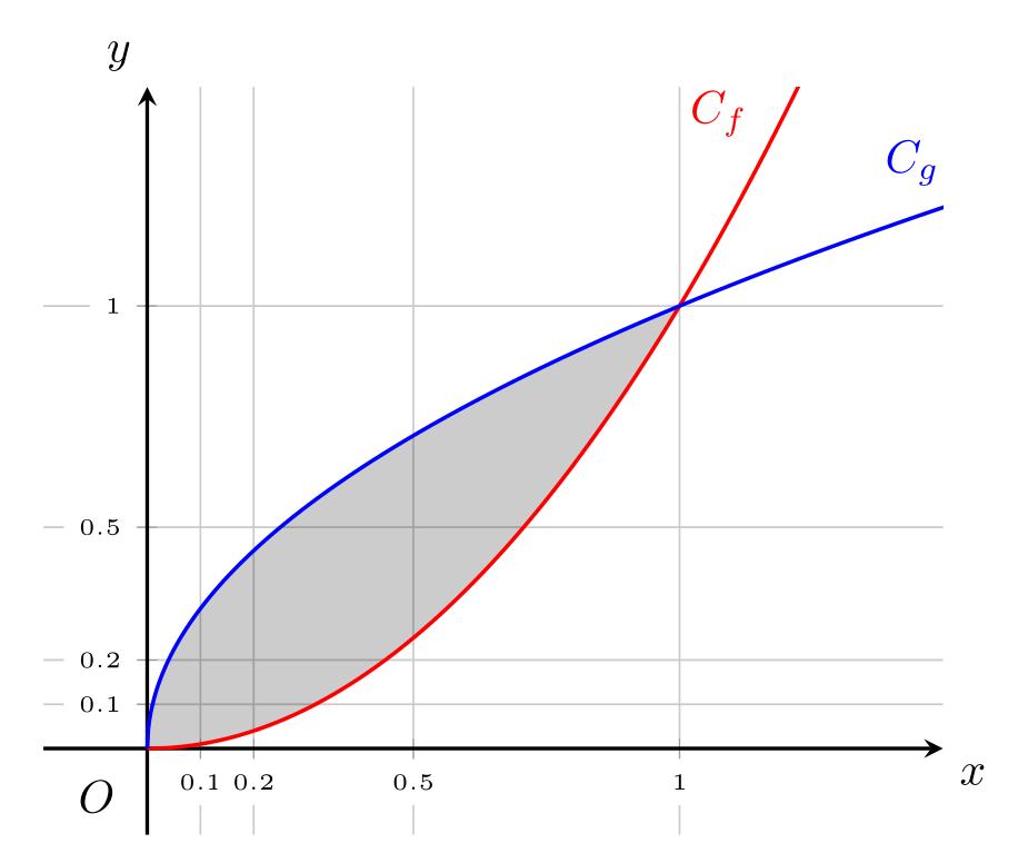
And to shade the area between two curves we use another plot instead of using the xAxis path we used earlier. it would be like this:
\documentclass{standalone}
\standaloneconfig{border=2mm 2mm 2mm 2mm}

%maths
\usepackage{mathtools}
\usepackage{amsmath}
\usepackage{amssymb}
\usepackage{amsfonts}

%tikzpicture
\usepackage{tikz}
\usepackage{scalerel}
\usepackage{pict2e}
\usepackage{tkz-euclide}
\usetikzlibrary{calc}
\usetikzlibrary{patterns,arrows.meta}
\usetikzlibrary{shadows}
\usetikzlibrary{external}

%pgfplots
\usepackage{pgfplots}
\pgfplotsset{compat=newest}
\usepgfplotslibrary{statistics}
\usepgfplotslibrary{fillbetween}

%colours
\usepackage{xcolor}

\begin{document}
\pgfplotsset{
   standard/.style={
      axis line style = thick,
      trig format=rad,
      enlargelimits,
      axis x line=middle,
      axis y line=middle,
      enlarge x limits=0.15,
      enlarge y limits=0.15,
      every axis x label/.style={at={(current axis.right of origin)},anchor=north west},
      every axis y label/.style={at={(current axis.above origin) },anchor=south east},
      grid=both,
      ticklabel style={font=\tiny, fill=white}
   }
}

\begin{tikzpicture}
   \begin{axis}[standard,
         xtick={0.1,0.2,0.5,1},
         ytick={0.1,0.2,0.5,1,2},
         xticklabels={$0.1$,$0.2$,$0.5$,$1$},
         yticklabels={$0.1$,$0.2$,$0.5$,$1$,$2$},
         xlabel={ $x$},
         ylabel={ $y$},
         samples=1000,
         xmin=0, xmax=1.3,
      ymin=0, ymax=1.3]

      \node[anchor=center, label=south west:$O$] at (axis cs:0,0){};
      \addplot[name path=F, line width=0.3mm, red, domain={0:2}]{x^2} node[pos=0.4, above left] {$C_f$};
      \addplot[name path=G, line width=0.3mm, blue, domain={0:2}]{sqrt(x)} node[pos=0.8, above left] {$C_g$};
      \addplot[fill=black, fill opacity=0.2] fill between [of=F and G, soft clip={domain=0:1}];
   \end{axis}
\end{tikzpicture}

\end{document}
And the result will be like this
And that's it. I hope you liked this latex tutorial. and let me know in the comment section bellow if I missed something or if you have any suggestion or request for another latex tutorial. happy writing
Related Articles


Most Recent Articles


Most Viewed Articles


0 Comments, latest
No comments.